Sunday 27 November 2011

What is a director's commentary?

Although there are many different ways of presenting a director's commentary, a director's commentary is primarily an additional feature on a DVD or digi-pak product which provides commentary from one or more speakers which provides an insight into the creation and the ideas behind the product.

One way a director's commentary can be presented is as an additional audio track directly over the main feature product itself, called the feature-length or screen-specific; the speakers talk about what is directly on the screen at the time. However this method may be difficult to use for a commentary over a music video because music videos can be much more fast-paced than other media products such as films. 

Another method of a director's commentary is the partial or scene-specific method of visually displaying clips which has a nature of interest to the speaker and then transitions to the speakers providing commentary of the scene. This solves the problems in the prior method of a directors commentary by pausing and making a commentary between clips. However this means that the commentary will be longer in duration than the main feature.


Research: What is a director's commentary?

A director's commentary is an explanation and analysis of a product, these are commonly available on the bonus features of DVDs. The director usually adds his explanation with an audio track, these sometimes include actors and other members of the production team for further explanations. These can be very detailed explanations which will show how clips/shots were create, almost like a behind-the-scenes insight into the production of the product. The commentary will also include views on the narrative and the construction of non-cinematography related aspects of the product.

There are two types of director commentaries, the first is partial/scene specific which highlights specific parts of the products. The second type if a feature-length commentary, this is where the director and other speakers watch the movie from beginning to end and give thoughts on parts of the product as is it being watched. A feature-length commentary is the most common, and as I mentioned earlier this will include actors, production team members, writers and other important members.

Evaluation: DVD Cover

We decided to go with a less conventional DVD design by using the gatefold shape. This does have the pitfall of looking like an album, however we focused on using other elements such as the text and track listing to make it more like a DVD.

The front cover of the DVD, on the right, follows the blue colour scheme seen the magazine advert and also represents the mood of the original music video. The artists name and a unique title for the DVD are also displayed clearly. The idea of using a sticker on the front cover was an important method in showing that this product was a DVD, it describes this product as including the music video featuring Kanye West. This is one element which helped to make the design look less like a album or single cover. On the back cover we used two images dissolved into one another, one of these images was used in the magazine advert which shows a sense of continuity. By using the same image it also makes the product easily identifiable for the consumer and creates a sense of branding. The last part of the design is the inside panel, on the left, we formed the idea to use lyrics from Adele's previous albums and to arrange them into an abstract pattern or design. This idea is particularly successful as the DVD is aimed at fans of Adele, therefore they would be interested in these lyrics and would find the design appealing. Another reason for the idea was because we didn't want to use screenshots from the music video, this is because it wouldn't follow the blue theme that we already had and the images would generally be poor quality.

In the future it would have been a good idea to try the DVD design instead, this would have prevented any uncertainty as to whether the product is a CD or DVD product. Hopefully we have been able to rectify this with other elements. Also, on this gatefold design, it would have been even more appealing if we had filled the lyrics panel completely so that there is a puzzle-like effect created.

Overall I am very satisfied with this design, combined with the magazine advert it creates a very professional and well planned set of products. I can imagine both being used in the real world.

Evaluation: Magazine Advert

Our magazine advert follows the blue theme which we wanted to use, this shows the mood of the original music video. By using dark colours and shadows we have been able to appeal to the rap genre, it's conventional to have dark lighting which represents mystery or crime, this is important as it is a product featuring Kanye West. The font is very simplistic and follows Adele's elegant style, yet it is also acceptable for the rap genre which we are trying to appeal to. The text itself is very clear, specifically the 'out now' text which is very important for marketing purposes, it stands out against the darker background and is a centre area of focus. The use of a 'star' rating has worked as planned, the contrasting colour of red again stands out against the background and will draw the attention of the reader. The photo itself fades into the black background which creates a very soft atmosphere to the image, again reflecting the genre and the artists style well.

In the future, if our group had more time to develop an advert there are several changes we would make. Firstly, the central image seems very dull and therefore the reader could easily ignore it. At this stage we are unaware of how bright the image/advert would actually appear when professionally printed, this is the reason we were unable to adjust the brightness. Another change would be to add some more information to to advert, such as price and few more logos as the bottom part of the advert seems fairly bland. The last change would be to have a review/rating from a source that the target audience would know. For example, NME magazine or Rolling Stone are two popular mainstream music magazines which are likely to feature Adele or Kanye West. This would simply make the rating more reputate for our audience.

Overall I believe the simplicity of the design is why is works so well. If it was printed professionally I think this advert would do a good job at promoting and selling the artist.

Monday 21 November 2011

Ancillary Products - 21/11/11

Today we began to experiment with the images in Photoshop. We have decided that all the images used should have a consistent blue tint, this will also work well with our music video which has uses a blue filter. We also feel that this colour reflects the mood of the characters and will create a 'moody' atmosphere in the photos that are used. This would be particularly beneficial in the real-world, it would create an emotive response from the audience and draw their attention.

Of-course the magazine cover will be an A4 shape, which is fairly basic to create in Photoshop. However, we have two options for the digipack, a standard DVD shape or a Gatefold shape. The gatefold is more common with CD covers, although it does offer very original approach to the digipack. The DVD shape will work with a lighter photo on the front cover, and the darker silhouette photo on the back, this effect would give the product depth and another visual dimension.

Standard DVD shape

Gatefold shape

I have done some further editing in Adobe Lightroom, this is because we wanted the 'Cyanotype B&W' effect on all our photos. After deciding on the three strongest photos, I edited them with this effect and then began to use the adjustment brush to 'dodge & burn' specific areas of them. Below is a screenshot showing the adjustments which can be made with the brush, alongside this is part of a photo with the dots which signify the adjustment areas.

Adjustment brush example
One photo was well composed and was very dramatic but the Adele character's face was very harshly lit. I wanted to change this, so I used the adjustment brush again. You can see the change in the screenshots below, the exposure here is far better. You will also notice the dot which signifies the point where the adjustment brush was used.

Adjustment brush example
After editing the three photos in Lightroom, I believe I have create some 'moody', consistent images which will work well in both our products. I have added them all below.

Sunday 20 November 2011

Digipack Features

Here are a list of the elements which we must include in the digipack for success.
  • The front image should show the artist and follow a theme, this can be a colour scheme or the use of specific images.
  • There should be the artists name on the cover, and the title of the DVD (Right Under My Feet) in clear writing.
  • Fonts should be unique and recognisable, almost like a form of branding or marketing. In our case, Adele has fairly simple and curvy font styles.
  • The colour scheme is blue and black combination, this reflects the initial mood of the 'Melt My Heart To Stone' music video and fits with the stylizing of the music video.
  • The front cover will also include a sticker/note to show that 'Melt My Heart To Stone' is included in the DVD which features Kanye West. This will prevent the product from appearing like a single cover of album cover.
  • A video listing on the back. We are going to have several live videos, some behind-the-scenes videos and interviews with both the artists on making the track, along with the director's commentary.
  • Barcode and other relevant logos on the back, such as the record label Columbia and the classification logo '12'.
  • To add some professionalism we will include some copyright small print.
  • Websites/contact information.

Magazine Advert Features

It is important to include these features in our magazine advert, as it will represent the artist and provide all the relevant information. Below is a list of these features and and details as to composition, placement and other ideas are all included.
  • Artist image - It is important that the colour scheme used in our magazine advert matches the DVD design, this will make it more recognisable for customers and they will be able to visually match the two products. We are going to use a blue theme as this best represents the mood of the song, and also fits with our music video styling.
  • Artist name - Adele's name is obviously going to be present on the advert, but it is also key to include Kanye West as a featured artist on the DVD. He was a prominent part of the both the song/remix and the music video which we have created. Using two artist on the cover of this advert will broaden the audience, and as a result of this create more sales.
  • DVD title - The title will be "Right Under My Feet" which is a lyric from the song/music video of Melt My Heart to Stone. We didn't want to use the song title as this would make it appear more like a an album or single release, which would be misleading for the customer and of the artist. This lyrics has a down-to-earth feel, which would definitely represent the depressing mood of the lyrics used in Adele's original track.
  • Release date - We will simply be using "Out Now" for the release date, this will be positioned further towards to the bottom of the advert. The reason for this is because it will be close to the review/rating, and album the logos of relevant shops or online store where it can be purchased. The idea is that the "Out Now" text will lead the reader onto these other pieces of information.
  • Relevant logos - The customer will need to know where the DVD is available, so generic iTunes and Amazon logos will be placed at the bottom of the advert. These brands are well known and recognisable for consumers, and so they will be the most effective at showing what type of release this product is. A record label logo will also be placed in one of the bottom corners of the advert, this will give the DVD more recognition and professionalism.
  • Quotes/Reviews - This is an incredibly important part of the advert as it will would be crucial for marketing. A quote from a reputable media organization with a 'star' rating will be given across the centre of the advert. Including the 'star' rating will grab the attention of consumers who glance over the advert as they look through a magazine. A 5-star rating would make consumers stop and see what as got such a good review.

Friday 18 November 2011

Response to feedback on final edit of the music video.

I am very pleased with the feedback which we were given. I thought that they were justified in what they said about the our music video. One of our main criticisms is that we didn't use a more varied shot-types; We did try out best to capture as many different shots as possibly, however time was a constraint on out filming, we also found that about half of our captured footage was unusable in the edit because the soundtrack could not be heard so that we could lip-sync it properly. One of our main positive points from the feedback is that nearly everyone said how the editing done very effectively. i.e. the tints and the use of split screen.

Ideas for DVD & Magazine Advert

After analysing some covers from different artist as well as Adele and Kanye West, we have come up with the following ideas for both our products:
  • Consistent colour scheme - blue tint and high contrast
  • Simple editing
  • A strong, unique and recognisable font for the artist.
  • Make sure the front and back cover link together, and the photos represent the narrative of our music video.

Analysis: Student Ancillary Products

The Whip
Both products compliment each other and show a consistent them which the group have obviously thought about. The images and colours represent a 'David Bowie' or 80s style which fits with the genre of their music video. In the magazine advert we can see a slow up of the artist, this features heavy use of makeup that is reminiscent of David Bowie. The florescent colours of green, blue and purple show the wild, party aspects of the genre and the abstract nature of the artist. All relevant details are included, a website for consumers to find further information, the artists name, a release date and quote.


The second image is their digipack/DVD cover. Again the cover focuses on a this glam-rock style which portrays the likes of David Bowie, Elton John and Westlife. The bright colours used this cover are similar to the advert and show a sense of continuity and theme. A barcode, production logo, classification and track listing are all included on the back cover to give a sense of professionalism. The most successful part of this cover, in my opinion, is the flipped image which the reader focuses on when they see the design. It is the simplicity of their designs which make them so appealing and successful.


Feist
Here is another good example of two products which work well together. The photos themselves do look very professional, and have an abstract style to them which suits the genre of the Feist. The photos have been taken during the shooting of the music video and show have an artist, action atmosphere to them. This would certainly grab the attention of consumers as a vivid new idea, however it is conventional for indie artist to experiment in their music videos. This magazine cover definitely sells the artist well, and fits with with the music video. Again all the relevant information is included, although I think it is more successful than 'The Whip' details as this group have used more variation. The font sizes are varied and the group has though about the placing and composition of different features.

The digipack again has an abstract design, as we see the image continue for the front around to the back. Consumers could find this very appealing, again making the product stand out from other conventional designs. Also it is a clever marketing trick to get consumers to look at the back of the digipack, and causing them to spend more time looking at the product. Again the photo is an action shot which gives a behind-the-scenes insight into the making of the music video.

Analysis: Beyonce Album Cover

Beyonce has a very strong theme for all of her covers, music videos and other media products. The album cover for her new album 4, uses the same colour scheme on the outside and inside of the design to make it easily recognisable. The design also focues on Beyonce herself as she is an easily recognisable artist. Her name has been used on the front and back of the album as people will just buy the album because it's Beyonce.

Overall the outside of the album is very simple, although the essential information such as record label, management, copyright notices, producer, tracklist, websites and barcode are all displayed on the back. Whereas the inside focuses on professional; fashion-inspired photography, this again shows her power in the industry.

We think that using a consistent theme throughout the design will be beneficial to our design because it makes it look like a professional product such as Beyoncé '4'. We also think the simpilicity seems to be a convention of many popular R&B artists such Beyoncé and Kanye West.

Beyoncé "4"

Analysis: Mary J Blige Album Cover

We have decided to assess a number of different album covers to gain ideas and inspiration for what may work well for our own digipack cover and which links well with our music video. Here is the album cover for Mary J Blige's album; the breakthrough. The front cover image is a good representative of the theme of the album because it is a close up of her face, where she is looking meaningful and innocent. The front cover of the album is in black and out however the back image is in colour, but the main colour theme remains black and white, with sky blue writing. There is a similar font used on the front, back and spine of the album cover however it is not exactly the same font. The same picture from the front cover is also used on the spine but obviously a lot smaller.
We could use this album cover theme for our own, perhaps with a picture of our female singer on the front and with the male rapper image on the back of the album. We would probably use a black background rather than white because most of Adele's album covers have a black background and we would like to continue this theme. Also, black would give a sadder theme which would match in with our music video better.

Inside the CD cover, the theme is the same as the outside, with a close up image of Mary J Blige's face from a side angle. There is also a faded face of her on the book that comes with the Case, this again is the same theme as the other images.

Analysis: MGMT Album Cover

We'll be analysing the album design/artwork for Oracular Spectular by MGMT. The album design is successful because it uses a consistence colour/image theme on the outside covers and inside they contrast this with a black and white image of the artist. The bright colour scheme represents the genre of music, and makes it easily recognisable for the the artist's fans. These colours have also been used on single covers from the album, and the music videos such as 'Electric Feel'. There is a tribal theme in the photography and the 'Electric Feel' music video which makes the band very unique, and again makes them easily recognisable.


The the simple logo has been used on the front cover, but also on the spine and on the inside. All the relevant information is included, the parental guidance sticjer, the barcode, track listing, the record labels, production, distribution, copyright notices and websites. On the inside there are details on directors and producers, the thank yous, and the recording location. These are ideas which we want to include in our music video digipak.

Blog response

I am happy with the comments we recieved from the other groups in our class. The main criticisms of our video is that the acting isn't great or that it seems to drag on. In response to this, I believe that it was a hard video to act as it is very emotional at the start and more upbeat in the second half, and the changing tempo was hard to adapt to. The dragging of the video may seem to be there but i belive that we couldn't keep changing the location and costume and other things as this would have diverted the attention away from the storyline and this therefore would have made our music video unsuccessful. Overall, i am very happy with the mu video and the comments are good about our lyp syncing overall and the video as a whole.

Wednesday 16 November 2011

Review: Music Video Feedback

It's important to get feedback from other groups, this will give an honest indication as to whether our music video was successful, and if we had improved since the rough cut.

Group 27's feedback was very satisfying, they liked our idea and thought that the general narrative correlated well with the songs message. They specifically commented on the lighting filters we used, I find this particularly encouraging as it was an idea the group had to improve the overall atmosphere. However they said that the rap section could have been made better with accurate lip-syncing. I disagree with this, as we are sure that it was lip-synced correctly, it way seem off-time as the rap is quite fast.

Group 28 particularly liked the first half of the video, in the hotel room, with the slow cuts being very successful in their opinion. The group also commented on the success of parallel editing which allows the audience to follow the narrative of the music video. This is crucial as the music video centres around the strength of the narrative.

Group 25 commented on the flashback idea which we added towards the end of the editing stage, we felt this was strength of the video, and so did group 25. Again they said this flashback made the narrative more clear and gave it some finality.

Group 30's feedback of our music video was particularly critical, however this honesty does show a different perspective. They highlighted the thoughtful editing, and the flashback clip again, along with the professionalism of the piece overall. Having said this, the group thought that certain parts of the music video began to drag or became less interesting - generally towards the end. I feel that this clips slow down here because the song is coming to an end, and we wanted to create a more intimate atmosphere.

Group 29 liked most aspects of our music video, including the lighting, location and costumes. However one area of improvement was to add more shots to the rap scenes. We are well aware of this and feel that in the future we would add more shots to the part, this would represent the rapper better and the general beat of the song at this point.

Overall the feedback was very good, and I feel that all the groups managed to comment on different aspects of the music video. This proves that many elements of our music video are successful and appealing to the audience.

Tuesday 15 November 2011

Final Music Video Feedback

Group 27:
We all thoroughly enjoyed the music video. The whole concept of the video was very well executed, and we liked it.

Did the piece meet the genre conventions?
We found that the video met the conventions of the genre very well, having a video as slow and sad as the song itself.

Did the piece use editting techniques well?
There was a wide variety of editing techniques used in the video - all of which we thought were well implemented, uses such as the split screen and light filters were well executed.

Does the piece sell or promote the video well?
Yes. The video follows the lyrics of the song very well and the video looks mature and professional.


Does the piece use effective camera angles?
The video uses a wide variety of camera angles all of which make it look unique and professional.

Some bits could be better lip synced as sometimes it looks a bit off time (on the bridge when Nick is rapping)


Group 26:
Genre conventions - we believed that the clip represented the genre well because the narrative fit into the genre type e.g. the slow pace, which was reflected through the slow cuts and clips especially at the start.

Editing techniques - the split screen technique was very effective, and allowed the audience to keep track of both artists and to see both characters point of views as well as their emotions at the same time. Also, the lighting was really well done.

Camera angles - they used a variety of camera angles, such as using props to create the angles like a mirror, which worked really well. however, more shot types could've been used to add another dimension to the storyline.

Sell or promote the video - the costumes sells the artist, e.g. the color represents the male


Group 25:
Really good lip syncing, aswell as storyline. Costumes were appropriate and fitted well.
very good editing techniques used like the flashback scene in the background to clearly represent the storyline to the audience.
cheesy ending let it down Nick.....
very beautiful and photogenic choice of actors
very

Group 30:
Very stereotypical video for the song and this seems to be the trend for slow hip hop video. The footage and lipsyncing also worked very well and look quite proffesional. The choice of shots was quite small and was generally filmed from a eye level and made watching it quite boring. The footage represented the genre well and stayed true to the conventions. The editing was done well with clear thought put into it and the montage that was emposed in the background worked well. started off really well but after that i lost all interest and it become a drag. this is a shame as it had high potential and better acting was needed and more tohught into the video as a whole.

Group 29:
Genre conventions:
We think this music video follows all the genre conventions. A very good use of costumes, props, lighting, costumes etc..
Editing:
We thought the editing was really good, The lip syncing was spot on and the use of effects was great.
The rap scene and some of the other scenes could have been edited a bit more with some more shots as some of these scenes lasted too long.

Final Music Video

Here is the final edit of the music video.

Monday 14 November 2011

Editing Diary - 14/11/11

Today was our final lesson to edit and complete the music video. We we're able to add in our rewind effect, this occurs on the long note before the instrumental. Originally there was a fairly long clip of the Adele actress holding this note, it seemed very awkward and almost boring. We thought this note could be used to symbolise Adele as she thought back over the trauma of the argument earlier in the video.

The idea of the rewind effect is to have all the clips from the hotel scene, and to play them backwards as if they are being rewound. All these clips were arranged as a separate layer under Adele's long note, all the clips were also sped up to three times the original speed. Using a dissolve effect, we made both the original clip of the Adele actress, and the rewind clips viewable. This works quite well, it's a very original effect and shows an individual style. This effect also feeds into the next clips well, as they use dissolve as well. It gives the video good continuity, shows off our skills, and enhances the narrative.

We we're also able to add colour correction to the rap clips, we thought that a slight blue tint would sharpen the clips and give them a dramatic atmosphere. It also shows good continuity as the hotel scene is stylized with blue colour correction.

Friday 11 November 2011

Editing Diary - 11/11/11

Toady we continued to add the finishing touches to the music video. After researching Kanye West's video effects, and colour correction styles, I decided to add some contrast onto the rap scenes which gives a similar effect. I also added in a few more transitions such as a split screen and dissolve to give the video more variety. The alley section of the rap was quite monotonous before, so I broke this up with an addition clip.

After getting feedback from the teachers we have been able to greatly improve our video, the variety, making it more enjoyable for the audience. On Monday, we will add in our rewind effect (explain in Monday's post) and some more colour correction to the rap section.

Editing Diary - Last Lesson

Today, it is the second last day of editing, therefore we will be trying to perfect our video as much as possible. We are missing two members of our group, so Sam will continue to edit as much as he can, whilst i will continue the research into the Ancillary products. George not being here is a little bit of a problem as he knows lots about final cut, so we are limited to what we can do until monday where he can add some finishing touches.

Thursday 10 November 2011

Feedback Evaluation: Media Studies Teachers

We thought it would help us to get some feedback from our teachers and the course team leader. This will enable us to achieve a better music video, that is more successful, enjoyable and meets the marking criteria more strongly.

The general feedback was that the hotel scenes were strong, and that the artificial lighting had defintely assisted this. However, the rap scenes are weaker and reminiscent of "home movies". This is partly due to the natural lighting, the performance and the flat effect of some of the shots. But we have been given some advice that can greatly improve this.

We were shown Beyonce's new music video "Countdown", which has a very simple narrative yet is still engaging for the audience. You can see that the quick cuts, and the effect of returning to similar shots gives the video variety. The production team have also decided to use a wide range of special effects and transitions to break up the footage. Split screens, wipes, fades and other transitions all give the video variety.


After looking at this video we are able to see how a video can be made more engaging. If we can make our cuts quicker then this will give the video more pace and action. As we have a clear narrative we can use split screens to illustrate parallel events, this is an example of parallel editing. Even simple effects such as dissolves and fades will improve the general delivery of the piece. We have also been advised to use the colour wheels and hues to adjust the colours, this both improving the "home movie" effect which we have, and also giving some depth.

One area of improvement is the long note from Adele before the instrumental. We are currently just showing one shot of the Adele actress on the fencing, this is quite bland. George had the idea that we could do a flashback or rewind effect, where everything that has happened before this note will be shown in a quick rewind effect. This will give the impression that Adele is thinking over the argument and will link in well with the narrative, it also shows our editing skills as we will both use speed and rewind tools to create this effect. This flashback section could be in black and white, like earlier flashback clips. Below is a screenshot of this long note, to show how we will improve it.

Editing Diary - 08/11/11

We have now completed the cutting process. Now we are working on the effects, transitions and stylizing of the video. A blue tint is going to be used on the hotel room scenes, as this reflects the mood that we are trying to create. The rap scenes however need a different style as these shots all use natural lighting, this causes the effects to look different outside.

In Kanye's video "Runaway", the video has been enhanced by a very high contrast edit. This has emphasised the colours of green and black. It also appears as if the colours have become more saturated. You can see "Runaway" below, and another video "Amazing" which uses similar techniques in it's lighter scenes. We could trial this in our own video.


As you can see the colours of green and blue are very prominent. We will experiment with these colours and add them to our blog when we next edit.

Monday 7 November 2011

Ancillary Products: Fonts

We have been research previous media products from our artists. Along with the styles and photography that we have found, it is important to also consider the logos and fonts used.

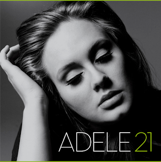
Adele's latest album "21" has a very simple font. I found a forum thread on DaFont (here) which offers some suggestions as to the fonts used on Adele's cover. The font is most likely "Existence Light". It's crucial that we use a recognisable font on the ancillary products, this is because it will be noticeable for our target audience. This goes hand in hand with the use of a colour scheme and styling of the photography. Although "Melt My Heart to Stone" was originally from Adele's "19" era, there have been several Urban Noise Remixes that use this font and colour scheme. Also Adele is currently promoting and touring with the "21" album, so it would make sense to follow the current colour scheme and fonts.


Above is Adele's "21" album cover. Below is an example of the Existence Light font:


Adele may be the main artist on the track, but Kanye's fonts must be considered too. Kanye has changed his styling and use of fonts over time. On one of his most recent covers for "808s & Heartbreak", the font is again very simple and at a fixed width and spacing. The fonts for both Adele's cover and Kanye's are both simple, and follow a similar font-family.

Editing Diary - 07/11/11

So far we have edited the main sequence together. This process has involved lip-syncing all the necessary clips and arranging them in the correct order so that the narrative makes sense to the audience. The fact we filmed shots multiple times benefited us when it came to editing because we had had a choice of shots which we could use.

After lip-syncing and arranging clips we will add video filters and transisitions to the video to generate a stylistic feel to the video. We have previously experimented with a blue tint in our test footage, and we think that this would still be a good idea as it will represent the sad theme. We would like to add a lighting streak filter to our video because we have seen it used in professional music videos and we think we can use it to enhance our lighting.

In the first screenshot you can see our timeline during during the hotel scenes of our music video. The lighting effects have worked quite effectively as you can see on the Adele actress, we still want to add some colour correction to these shots to enhance there delivery. The second screenshot displays our use of a black and white/colour correction. In this particular shot the desaturation has been used to signify the flashback within the narrative.


Plan - 07/11/11

Today, we will continue to edit the video so that it will be completed for our deadline. By the end of the lesson, we will only have a small section of the video to complete. We are trying to edit the sections in the track where the lip syncing did not work so well and sections where there are no lyrics at all. We will do this by using little clips of adele and kanye west on there own in the seperate locations so the song is still following the storyline.

Notes after lesson:
We have now completed cutting the video, and have begun to experiment with some colour correction filters. These will be details in a post soon. We still need to improve the rap parts as this the weaker part of our music video, this can be achieved with some colour correction and adjusting the order of the shots.

Friday 4 November 2011

Classification Research

Every video should be given a classification, the BBFC has guidelines so that all videos/media are classified correctly. We think that although the video is suitable for all ages, the content of the rap lyrics would suit a 12 classification. The guidelines for this are as follows:
  • Discriminatory language/behavior must not be endorsed by the work as a whole.
  • Any misuse of drugs must be minimal and should not be condoned.
  • Moderate physical/psychologic threat may be present but should be infrequent and unsustained.
  • Dangerous behavior that could be imitated should be absent from film.
  • Moderate Language is allowed.
  • Brief sexual content is allowed.
  • Mature themes are allowed but must be appropriate for younger teenagers.
  • Violence in the film should not be focused on gore/injuries unless it is justified by the context

Plan - 04/11/11

Today is one of the last lessons we will have to edit our video, we are currently cutting and placing our video clips. We have a lesson on Monday, Tuesdsay and an hour of the lesson on Friday to finish off our video. We plan to make sure that all of our clips are in the correct place by the end of Mondays lesson and then on Tuesday and Fridays lesson we will add in effects and make the final touches to the video.

Tuesday 1 November 2011

Rough Cut Feedback

Positive feedback
  • Lip syncing was good
  • Really well thought out locations
  • Great outfits and varied shots
  • Great editing
  • lighting is really good
  • Good selection of mise-en-scene
  • Acting was brilliant
  • Good character choices
  • Good variety of shots
  • Good continuity

Constructive feedback
  • Quicker shots needed of the male singer?
  • Kanye West part needs more action?
  • Lip synching could be slightly more emphasized?
  • Need to make more of the argument flashbacks?
  • Rap part at the end goes on too long in comparison to the beginning of the video.
  • More variety of camera angles?

In order to overcome the feedback, we need to edit the shots of the rapping to make each shot a bit shorter, and more dramatic, we also need to edit the rest of our shots to fill the whole music video and use a variety of shot types we filmed. We will see if we can change the other feedback points and see if it makes our video more effective, if not we will keep it the same.

Plan: Week After Half-Term

There are several things that we still need to do in the project, here are list them all:
  • Complete editing rough cut footage
  • Write a post on the rough cut, and how we can improve it
  • Research fonts
  • Research the classification
  • Research digipack covers
  • Research magazine covers
  • Begin to work on digipack or magazine cover
  • Put animatic on the blog
  • Put location assessment on the blog
 
© 2009 13S1-28 Music Video 2011. All Rights Reserved | Powered by Blogger
Design by psdvibe | Bloggerized By LawnyDesignz