Showing posts with label George Adamson. Show all posts
Showing posts with label George Adamson. Show all posts
Friday, 9 December 2011

Monday, 5 December 2011
Evaluation - George Adamson
1) In what ways does your media product use, develop and challenge the conventions of real media products?
My product uses many conventions of a real media product in terms of Goodwin's points. These points were preposed by Andrew Goodwin in the 1990s notable for Music Video theory book “Dancing In The Distraction Factory: Music Television and Popular Culture” These points are the common conventions which music videos usually follow, these points are; Music videos demonstrate genre characteristics, a relationship between lyrics and visuals, relationship between music and visuals, The demands of the record label will include the need for lots of close ups of the artist and the artist may develop motifs which recur across their work (a visual style), themes of voyeurism, and intertexual references to other real media products or consumer products.
We tried to think about the music video’s genre as much as possible during our research. We made our research around R&B, soul, rap and hip-hop music videos because we decided that the song “Melt my heart to stone” would best suit the conventions found in the music videos of these particular genres. One of the way our music video represents these types of genres because of the way our music video presents the female artist in an almost sexual context because of the way costume is used to make the ‘Adele’ character look attractive to the audience. Also the the costume of the ‘Kanye West’ character is a suit which is a common convention of costume for R&B and rap music videos.
We challenge conventions by the way costume stays consistent throughout our music video.
We decided not to have frequent costume changes (Seen in music videos such as Beyonce’s Who Run the World music video - directed by Francis Lawrence who also known for directing music videos for Lady Gaga, Britney Spears and the Black Eyed Peas). However upon watching Adele’s Rolling in the deep music video (directed by Sam Brown) we decided we would follow the conventions used in that particular music video of staying in a single costume throughout the whole video.
One of the way theme theme of voyeurism is conveyed is by the use of mirrors in our music video. In the hotel scenes. This makes our audience feel as if they are watch the characters from inside the room for example when you see the ‘Adele’ character put on make up you feel you are just watching her from inside the room. A similar effect is produced where the “Kanye West” character walks-out the hotel room past mirrors you feel in a way you are watching him through the mirrors.
One of the ways which we have challenged conventions of a typical music video is our decision to portray both the artists involved in the song very strongly and equally, for both the character’s the importance is never focused on either one of the characters for the whole of the music video and both characters seem to have equal amount of “screen-time”. We found that the usual conventions for this style of music video was to focus the importance on one character during a music video and have the other occasionally appearing in from the ‘sidelines’. I believe our decision links to Goodwin's point of “the demands of the record label” because we attempt to sell both artists equally to the market/audience therefore increasing chance of the audience buying future products from both the artists.
We have have strongly followed the conventions of using lip-syncing in our music video. This is a convention which is highly used in music videos. The use of this conventions is follows Goodwin’s point of “a relationship between lyrics and visuals” because the audience see the lyrics portrayed being sung from the character. However we develop this convention by the use of a strong narrative within the music video which is not a a very common convention found in music videos, However we took inspiration from The Beastie Boy’s “Make some noise” (also known as “Fight for Your Right - Revisited) Music video which can be more accurately described as a short film rather than a music video because it has a weaker focus on lip-syncing performance of the characters than the focus on it’s strong narrative, it’s cinematographic techniques and it’s strong acting talent involved in the video, on the Director, Adam Yauch’s IMDB profile the video is in-fact described as a ‘short’(film) rather than a music video. In taking inspiration from this and using it in combination with the lip-syncing technique. However we break from Adam Yauch’s approach of splitting between lip-syncing performance and narrative, Our video shows the artists lip-syncing from start to finish with the music and lyrics providing the bases of the narrative.
Overall using Goodwin’s points has been helpful to the construction of our music video because it has helped us to have a structured plan to what is going to be included in our music video, using Goodwin’s points has made us think about each element of a music video individually and how they fit into the music video as a whole. Looking at each convention independently has made me and my group think about what they represent in the music video and how the conventions can be used effectively.
2) How effective is the combination of your main product and ancillary products?
The combination of my main product and ancillary texts is very effective because of the conventions they follow. One of these conventions is the use of a consistent colour scheme throughout our both the main product and the ancillary texts, I.e. The blue tinted colour scheme which appears in the hotel scene in the main product and the blue tinted photographs used in the ancillary texts. We had set up lighting in the hotel scene to look quite moody and theatrical. These enables the market audience to identify the Ancillary texts and the Main music video together so it would be recognisable to the buyer when they purchase the digi-pack package.For the Hotel scene we used Final Cut Express to add a light-blue tint with a high contrast to the video and used Adobe Light-room for the same light-blue effect to make the mood of the scene more moody and emotional. This makes the Main product and ancillary text look like a more complete product. This adds consistency to our product and overall makes it more recognisable and rememberable to the audience/market so if they see the magazine advert they’ll recognise the Digi-Pack, the advert will be drawn into the market/audience mind and they’ll be more likely to buy the product.
The main product and ancillary texts help create a celebrity image for the artists. The ‘Kanye West’ character is presented as in a “gangster” hip-hop style which is represented by the suit which the artist wears in our music video and the photos used in the music videos and is a common costume convention used by similar artists such as Akon. The audience and consumers will be encouraged to buy our product because they’ll recognise similarity between Kanye West and similar artist so they’ll be able to tell if it is a product they would enjoy.
The ‘Adele’ character is presented in an attractive and sophisticated style which is represented by the black dress which the artist wears throughout our music video and our ancillary texts. This costume is similar of a similar style to Amy Winehouse who was a singer of the same genre as ‘Adele’. This is used much to the same effect of Kanye West’s costume of presented the artist to be similar to artists which can be related to Adele and Kanye West because the audience will be able to tell what genre this music video possibly is before they see the music video or hear the song and possibly therefore being more encouraged to buy the product.
I believe that the combination of our main product and are ancillary products are effective in selling the artists and selling the music video on the market because of the way it utilises familiarity in it’s genre. People can be drawn to artists because of the way they dress if they dress similar to artists who they are also similar and can be compared to. The similarity in styles between our music video and our ancillary product helps to create a cohesive package where each product can be identified together which helps the audience recognise the product if they see the magazine advert and then see the digi-pack in a shop.
3) What have you learnt from your audience feedback?
The feedback we’ve received from our peers and teachers has helped me and my group develop and examine aspects of our product by the amount of positive feedback telling us what has been good about our product and the positive criticism telling us what can be improved in our product and whether the aspects in our music video works together as a whole. We received feedback in three different stages of progress in the creation of our music video; The Pitch, The Rough-cut and our Final Edit.
The feedback we received for our initial pitch was positive. Our pitch was a summary of our main ideas of what we wanted our music video to be and how we were going to put the music video together. Both our Peers and our Teachers said that we had mostly thought through our music video quite well in terms of Narrative, Locations, Cinematography and Lighting. However they suggested that we think more about How we were going to gain access to the hotel and whether we had a 2nd plan just in case the hotel didn’t let us film there.
They were also concerned who were going to the actors in our music video, However we assured them that if we could not find suitable actors to be in our music video, We (the members of the group) ourselves would be acting in the music video.
The feedback which we received on our rough cut could have been better in the terms of the value the feedback has given us in terms of positive feedback and criticism. This is because we had not finished editing our rough-cut together and therefore we were only able to show a short part of a music video. Because of this, there was concern of the quality of the music video and the speed of progress we were making on our music video by our peers and teachers. I feel that if we had shown a more complete rough-cut we would have gained more valuable feedback from our peers and teachers to help develop our music video in the post-production process instead of the main criticism of our feedback on our rough cut which was that we needed to continue editing our music video together. However whilst the rough-cut was short, we had gained some usable feedback. Our main positive was how we had used lighting in our music video, they noted that it had looked professional and well-done. They also noted that the actors we were successful in bringing in to act in the music video had performed well in the music video and it had been lip-synced very well.
The feedback we received for our just before and after final edit was mostly positive however there were a few criticisms. One of our main criticisms was that we had not used a wide enough variety of shot-types within our music video, this made some parts of our music video look quite bland and boring. However this was noted just before our final edit, so we tried to amend this by the use of split screen and tint on the rapping part of our music video to make our music video look more visually interesting to our audience. Our peers noted that the costume that the actors wore in the music video had made the actors look professional and believable, which is the feedback we were hoping.
Overall the feedback has been helpful to us in developing and improving our music video during the process of it’s creation. It has made us spend more time focusing on aspects of the music video we otherwise wouldn’t have done. However our feedback was stunted by the fact we had not shown a full rough cut. I believe if we had shown a full rough cut; our final edit would have been much better because we would have known we needed to add more shot-types and the editing would be much more natural and consistent.
4) How did you use new media technologies in the construction and research, planning and evaluation stages?
The use of new media technology has been vital to the successful research, planning creation and evaluation stages of our music video project. In our research stage of our music video project, we used the internet, more specifically YouTube, to research the common conventions of YouTube videos by watching music videos and noting what conventions and trends we see across multiple music videos. We had also used YouTube to research how to set up lighting for the specific purpose of filming a music video, without viewing this video we wouldn’t have seen the value in using extra lighting for our music video and our music video would have looked less professional as a consequence. We also used ‘Blogger’ to organise all of our music video project. This mean’t all of our groups research and planning can be accessed in one place. The main benefit of this was if one of our group’s members who had drawn the storyboard was absent on the day of filming, we would be able to access the story board from the blog and see what was shot was being required.
In the construction of our music video we used High-Definition Camcorders to film the footage for our music video. This enabled us to capture professional-looking footage which in comparison to camera’s we have used in our AS level Children’s film project, the camcorders we used now were much superior in terms of image quality. Another benefit of the HD Camcorders is the in-built hard-drive feature. Which meant we didn’t have to rely on tapes for our music video which limits the amount of footage we can take, it also speeds up the process of transferring the footage to the iMac computers for the post-production process. We also used small still image cameras to take pictures of our storyboard and shot-list so we could post the images of these items to our ‘Blogger’ blog.
We also used a tripod and a dolly in the filming process of our music video. The tripod has helped us create a profession product by helping us achieve better steady, static shots which in the music video looks very professional in comparison to our test-footage of an unsteady static shot where a tripod was not used.
The dolly has helped us capture steady moving shots in our music video.
During the Post-production process of the creation of our music video, We used a semi-professional video editing program “Final Cut Express” which is the ‘Lighter’ version of “Final Cut Pro” which is the video editing software most commonly used in the media, TV and Film industry. Using this software has enabled us to use professional editing techniques used by professional video editors in our music video such as the lip-syncing, split-screen, the use of fading between clips and the tint/colour correction effects we used in our music video which are usually present in professional media products.
We also used lighting during the filming process of the creation of our music video. We decided to use lighting in our music video after watching a youtube video explaining how to set-up lighting and the benefits of using lighting in the music video. We wanted the lighting to be used to make our music video look moody and theatrical which would benefit the mood of the hotel scene of our music video. We also used this lighting for the creation of ancillary products during our photo-shoot of the actors for use in our digi-pack cover and our magazine advertisement.
For our Ancillary Product’s photo-shoot we used a DSLR Camera which enabled us to take high-quality professional images for our ancillary products. These photos were then edited by Sam using Adobe Lightroom to give the photographs the a similar effect used in the hotel scene of the music video (the blue tint and the raised contrast). These edited photographs were then imported into Adobe Photoshop to create both ancillary products (by all group members). Using photoshop had allowed us to manipulate the images to look like a professional magazine advert and a Digi-pack cover.
Friday, 2 December 2011
Director's Commentary: Script
Directors Commentary script - Group 13S1-28
- Hello I’m George Adamson,
- Daisy Cookson
- Nick Griggs
- Sam Payne
All four of us have been working together over the past couple of months to create a music video for “Melt my heart to stone” by Adele (featuring Kanye West)
Question 1
One of the first things we did when we were given the task of creating a music video for this song was to research Adele’s and Kanye West’s previous music videos using YouTube and VEVO. This was so that we could get an idea of the style the performers are usually presented in. From this we were also able to learn more about the genre conventions of the music videos for their particular styles of music.
We decided that the song “Melt my heart to stone” best suited the slow R&B genre because it contains both singing and rapping. The conventions for this particular genre of music videos often shows a rapper showing off His “wealth”,“lavish” lifestyle and the women which are surrounding him in this music video. The music videos usually include a lot of intertextuality for example the artist may be seen wearing an expensive branded watch, this advertises the product and makes the artist seem wealthy.
We decided to challenge these conventions, since the song seems to focus on both artists equally, we decide that out music video should do the same instead of following one artist and having the other in the side-lines appearing at off points throughout the music video which is the usual convention for music videos.
We again decide to challenge the conventions of a music video because the way we use and strong narrative and strong use of lip-syncing performance in our music video. The usual conventions are either that you have a strong narrative and the lip-syncing is put to the side (shown in The Beastie Boy’s video “Make some noise” also known as Fight for your right - revisited video, where the music video is more similar to a short-film than a music video) or a strong lip-sync performance video such as Adele’s Rolling in the deep music video where the video Focuses more on her performance than a narrative.
One of the conventions we decided to challenge is the use of costume change within a music video. Our original outfits for the artists followed conventions; smart and classy, however the artist stays in these costumes throughout the video, this challenges the conventions because usually the artist will have a number of costume changes in one music video.
Question 2
One of the ways that we have used our main product and ancillary texts is the consistent look of both items. One of the ways we gave each item a look was the way we used lighting effectively in the creation of our music video and our Ancillary product photo-shoot. We set up lighting in the hotel scene to look quite moody and theatrical. These enables the market audience to identify the Ancillary texts and the Main music video together so it would be recognisable to the buyer when they purchase the digi-pack package.
We also applied a colour tint to both the music video (Main product) and the ancillary texts to the same effect we desired with the use of lighting. For the Hotel scene we used Final Cut Express to add a light-blue tint with a high contrast to the video and used Adobe Light-room for the same light-blue effect to make the mood of the scene more moody and emotional. This makes the Main product and ancillary text look like a more complete product.
The images used in the ancillary texts and the image the artists are presented in the main product creates a mature and attractive image though the use of costume for both artists which helps to sell the artists well. The Costumes; the black dress which “Adele” and the Suit which Kanye West wears makes both characters look attractive and sophisticated.
We used the same font in both items in the ancillary texts the posters and the digi-pack cover because We thought that a recognisable familiarity would benefit our product on the market. We chose a white font because of the way it stands out against the light blue image.
Question 3
The feedback we received for our pitch was positive, both our teachers and our peers agreed that our group had organised the technical elements such as narrative and lighting. We discussed the ideas on our locations and actors which were not finalised and received quite a positive response to our ideas.
The feedback we received for our rough-cut was mostly positive, Our peers and teachers said we had lip-synced well and followed common conventions of a music video in-terms of goodwins points and our peers and teachers were impressed with the use of lighting in the ‘hotel scene’.
However one of the problems with the feedback from our rough-cut was that we did not have a full rough-cut. We feel that if we had been able to show a complete rough cut, the feedback would have been more beneficial to the editing of the final cut.
The feedback which we received for our final edit was mostly positive. The majority of our peers and our teachers have said we have used macro and micro elements such as our narrative and the use of mise-en scene (for example the costumes and the lighting) in our music video. However one of the major criticisms we received was that we didn’t have a varied amount of shot-types in our final cut.
Question 4
One of the pieces of new media technology we used was the internet (more specifically YouTube) to research conventions of popular music videos and which conventions were not being used. We also used YouTube to research cinematographic techniques, editing techniques and for learning how to set up lighting effectively for a music video.
Another pieces of internet technology which we used in our project is “Blogger” which we used to organise our whole project. This was effective in enabling all members of our group access to information about our project such as our storyboard and shot-list, so we could continue with our work if another member of our group was absent.
We used HD Camcorders to record our footage for our music video. The footage from these cameras looked professional and the built in hard-drive enabled us to take multiple takes of shots for use in editing.
Another piece of technology which we used is Final Cut Express. This is semi-professional editing software which we used to apply professional editing techniques to our music video such as the split-screen and the colour-adjustment effects. This made our music video look professional. The editing also helps the audience to understand the narrative by keeping the continuity consistent.
We also used a DSLR camera for the photo-shoot for our ancillary texts. Using this enabled us to capture high-quality professional looking images for use in our magazine advert and our digi-pack cover. Lightroom was used to give the photos the effect similar to the effect applied in the main product, which we believed a consistency throughout our product would help to market our product.
Another piece of technology we used was a camera tripod which we used to keep our shots steady. We also used a dolly which we used for smooth tracking shots in our music video. We also used two lights to make our music video look more theatrical and professional.
- Hello I’m George Adamson,
- Daisy Cookson
- Nick Griggs
- Sam Payne
All four of us have been working together over the past couple of months to create a music video for “Melt my heart to stone” by Adele (featuring Kanye West)
Question 1
One of the first things we did when we were given the task of creating a music video for this song was to research Adele’s and Kanye West’s previous music videos using YouTube and VEVO. This was so that we could get an idea of the style the performers are usually presented in. From this we were also able to learn more about the genre conventions of the music videos for their particular styles of music.
We decided that the song “Melt my heart to stone” best suited the slow R&B genre because it contains both singing and rapping. The conventions for this particular genre of music videos often shows a rapper showing off His “wealth”,“lavish” lifestyle and the women which are surrounding him in this music video. The music videos usually include a lot of intertextuality for example the artist may be seen wearing an expensive branded watch, this advertises the product and makes the artist seem wealthy.
We decided to challenge these conventions, since the song seems to focus on both artists equally, we decide that out music video should do the same instead of following one artist and having the other in the side-lines appearing at off points throughout the music video which is the usual convention for music videos.
We again decide to challenge the conventions of a music video because the way we use and strong narrative and strong use of lip-syncing performance in our music video. The usual conventions are either that you have a strong narrative and the lip-syncing is put to the side (shown in The Beastie Boy’s video “Make some noise” also known as Fight for your right - revisited video, where the music video is more similar to a short-film than a music video) or a strong lip-sync performance video such as Adele’s Rolling in the deep music video where the video Focuses more on her performance than a narrative.
One of the conventions we decided to challenge is the use of costume change within a music video. Our original outfits for the artists followed conventions; smart and classy, however the artist stays in these costumes throughout the video, this challenges the conventions because usually the artist will have a number of costume changes in one music video.
Question 2
One of the ways that we have used our main product and ancillary texts is the consistent look of both items. One of the ways we gave each item a look was the way we used lighting effectively in the creation of our music video and our Ancillary product photo-shoot. We set up lighting in the hotel scene to look quite moody and theatrical. These enables the market audience to identify the Ancillary texts and the Main music video together so it would be recognisable to the buyer when they purchase the digi-pack package.
We also applied a colour tint to both the music video (Main product) and the ancillary texts to the same effect we desired with the use of lighting. For the Hotel scene we used Final Cut Express to add a light-blue tint with a high contrast to the video and used Adobe Light-room for the same light-blue effect to make the mood of the scene more moody and emotional. This makes the Main product and ancillary text look like a more complete product.
The images used in the ancillary texts and the image the artists are presented in the main product creates a mature and attractive image though the use of costume for both artists which helps to sell the artists well. The Costumes; the black dress which “Adele” and the Suit which Kanye West wears makes both characters look attractive and sophisticated.
We used the same font in both items in the ancillary texts the posters and the digi-pack cover because We thought that a recognisable familiarity would benefit our product on the market. We chose a white font because of the way it stands out against the light blue image.
Question 3
The feedback we received for our pitch was positive, both our teachers and our peers agreed that our group had organised the technical elements such as narrative and lighting. We discussed the ideas on our locations and actors which were not finalised and received quite a positive response to our ideas.
The feedback we received for our rough-cut was mostly positive, Our peers and teachers said we had lip-synced well and followed common conventions of a music video in-terms of goodwins points and our peers and teachers were impressed with the use of lighting in the ‘hotel scene’.
However one of the problems with the feedback from our rough-cut was that we did not have a full rough-cut. We feel that if we had been able to show a complete rough cut, the feedback would have been more beneficial to the editing of the final cut.
The feedback which we received for our final edit was mostly positive. The majority of our peers and our teachers have said we have used macro and micro elements such as our narrative and the use of mise-en scene (for example the costumes and the lighting) in our music video. However one of the major criticisms we received was that we didn’t have a varied amount of shot-types in our final cut.
Question 4
One of the pieces of new media technology we used was the internet (more specifically YouTube) to research conventions of popular music videos and which conventions were not being used. We also used YouTube to research cinematographic techniques, editing techniques and for learning how to set up lighting effectively for a music video.
Another pieces of internet technology which we used in our project is “Blogger” which we used to organise our whole project. This was effective in enabling all members of our group access to information about our project such as our storyboard and shot-list, so we could continue with our work if another member of our group was absent.
We used HD Camcorders to record our footage for our music video. The footage from these cameras looked professional and the built in hard-drive enabled us to take multiple takes of shots for use in editing.
Another piece of technology which we used is Final Cut Express. This is semi-professional editing software which we used to apply professional editing techniques to our music video such as the split-screen and the colour-adjustment effects. This made our music video look professional. The editing also helps the audience to understand the narrative by keeping the continuity consistent.
We also used a DSLR camera for the photo-shoot for our ancillary texts. Using this enabled us to capture high-quality professional looking images for use in our magazine advert and our digi-pack cover. Lightroom was used to give the photos the effect similar to the effect applied in the main product, which we believed a consistency throughout our product would help to market our product.
Another piece of technology we used was a camera tripod which we used to keep our shots steady. We also used a dolly which we used for smooth tracking shots in our music video. We also used two lights to make our music video look more theatrical and professional.
Sunday, 27 November 2011
What is a director's commentary?
Although there are many different ways of presenting a director's commentary, a director's commentary is primarily an additional feature on a DVD or digi-pak product which provides commentary from one or more speakers which provides an insight into the creation and the ideas behind the product.
One way a director's commentary can be presented is as an additional audio track directly over the main feature product itself, called the feature-length or screen-specific; the speakers talk about what is directly on the screen at the time. However this method may be difficult to use for a commentary over a music video because music videos can be much more fast-paced than other media products such as films.
Another method of a director's commentary is the partial or scene-specific method of visually displaying clips which has a nature of interest to the speaker and then transitions to the speakers providing commentary of the scene. This solves the problems in the prior method of a directors commentary by pausing and making a commentary between clips. However this means that the commentary will be longer in duration than the main feature.
Saturday, 26 November 2011

Monday, 21 November 2011
Ancillary Products - 21/11/11
Today we began to experiment with the images in Photoshop. We have decided that all the images used should have a consistent blue tint, this will also work well with our music video which has uses a blue filter. We also feel that this colour reflects the mood of the characters and will create a 'moody' atmosphere in the photos that are used. This would be particularly beneficial in the real-world, it would create an emotive response from the audience and draw their attention.
I have done some further editing in Adobe Lightroom, this is because we wanted the 'Cyanotype B&W' effect on all our photos. After deciding on the three strongest photos, I edited them with this effect and then began to use the adjustment brush to 'dodge & burn' specific areas of them. Below is a screenshot showing the adjustments which can be made with the brush, alongside this is part of a photo with the dots which signify the adjustment areas.


Of-course the magazine cover will be an A4 shape, which is fairly basic to create in Photoshop. However, we have two options for the digipack, a standard DVD shape or a Gatefold shape. The gatefold is more common with CD covers, although it does offer very original approach to the digipack. The DVD shape will work with a lighter photo on the front cover, and the darker silhouette photo on the back, this effect would give the product depth and another visual dimension.
 |
| Standard DVD shape |
 |
| Gatefold shape |
 |
| Adjustment brush example |
One photo was well composed and was very dramatic but the Adele character's face was very harshly lit. I wanted to change this, so I used the adjustment brush again. You can see the change in the screenshots below, the exposure here is far better. You will also notice the dot which signifies the point where the adjustment brush was used.
 |
| Adjustment brush example |
After editing the three photos in Lightroom, I believe I have create some 'moody', consistent images which will work well in both our products. I have added them all below.


Friday, 18 November 2011
Response to feedback on final edit of the music video.
I am very pleased with the feedback which we were given. I thought that they were justified in what they said about the our music video. One of our main criticisms is that we didn't use a more varied shot-types; We did try out best to capture as many different shots as possibly, however time was a constraint on out filming, we also found that about half of our captured footage was unusable in the edit because the soundtrack could not be heard so that we could lip-sync it properly. One of our main positive points from the feedback is that nearly everyone said how the editing done very effectively. i.e. the tints and the use of split screen.
Ideas for DVD & Magazine Advert
After analysing some covers from different artist as well as Adele and Kanye West, we have come up with the following ideas for both our products:
- Consistent colour scheme - blue tint and high contrast
- Simple editing
- A strong, unique and recognisable font for the artist.
- Make sure the front and back cover link together, and the photos represent the narrative of our music video.
Analysis: Beyonce Album Cover
Beyonce has a very strong theme for all of her covers, music videos and other media products. The album cover for her new album 4, uses the same colour scheme on the outside and inside of the design to make it easily recognisable. The design also focues on Beyonce herself as she is an easily recognisable artist. Her name has been used on the front and back of the album as people will just buy the album because it's Beyonce.
Overall the outside of the album is very simple, although the essential information such as record label, management, copyright notices, producer, tracklist, websites and barcode are all displayed on the back. Whereas the inside focuses on professional; fashion-inspired photography, this again shows her power in the industry.
We think that using a consistent theme throughout the design will be beneficial to our design because it makes it look like a professional product such as Beyoncé '4'. We also think the simpilicity seems to be a convention of many popular R&B artists such Beyoncé and Kanye West.
Overall the outside of the album is very simple, although the essential information such as record label, management, copyright notices, producer, tracklist, websites and barcode are all displayed on the back. Whereas the inside focuses on professional; fashion-inspired photography, this again shows her power in the industry.
We think that using a consistent theme throughout the design will be beneficial to our design because it makes it look like a professional product such as Beyoncé '4'. We also think the simpilicity seems to be a convention of many popular R&B artists such Beyoncé and Kanye West.
 |
| Beyoncé "4" |
Analysis: MGMT Album Cover
We'll be analysing the album design/artwork for Oracular Spectular by MGMT. The album design is successful because it uses a consistence colour/image theme on the outside covers and inside they contrast this with a black and white image of the artist. The bright colour scheme represents the genre of music, and makes it easily recognisable for the the artist's fans. These colours have also been used on single covers from the album, and the music videos such as 'Electric Feel'. There is a tribal theme in the photography and the 'Electric Feel' music video which makes the band very unique, and again makes them easily recognisable.


The the simple logo has been used on the front cover, but also on the spine and on the inside. All the relevant information is included, the parental guidance sticjer, the barcode, track listing, the record labels, production, distribution, copyright notices and websites. On the inside there are details on directors and producers, the thank yous, and the recording location. These are ideas which we want to include in our music video digipak.


The the simple logo has been used on the front cover, but also on the spine and on the inside. All the relevant information is included, the parental guidance sticjer, the barcode, track listing, the record labels, production, distribution, copyright notices and websites. On the inside there are details on directors and producers, the thank yous, and the recording location. These are ideas which we want to include in our music video digipak.
Tuesday, 15 November 2011
Final Music Video Feedback
Group 27:
We all thoroughly enjoyed the music video. The whole concept of the video was very well executed, and we liked it.
Did the piece meet the genre conventions?
We found that the video met the conventions of the genre very well, having a video as slow and sad as the song itself.
Did the piece use editting techniques well?
There was a wide variety of editing techniques used in the video - all of which we thought were well implemented, uses such as the split screen and light filters were well executed.
Does the piece sell or promote the video well?
Yes. The video follows the lyrics of the song very well and the video looks mature and professional.
Does the piece use effective camera angles?
The video uses a wide variety of camera angles all of which make it look unique and professional.
Some bits could be better lip synced as sometimes it looks a bit off time (on the bridge when Nick is rapping)
Group 26:
Genre conventions - we believed that the clip represented the genre well because the narrative fit into the genre type e.g. the slow pace, which was reflected through the slow cuts and clips especially at the start.
Editing techniques - the split screen technique was very effective, and allowed the audience to keep track of both artists and to see both characters point of views as well as their emotions at the same time. Also, the lighting was really well done.
Camera angles - they used a variety of camera angles, such as using props to create the angles like a mirror, which worked really well. however, more shot types could've been used to add another dimension to the storyline.
Sell or promote the video - the costumes sells the artist, e.g. the color represents the male
Group 25:
Really good lip syncing, aswell as storyline. Costumes were appropriate and fitted well.
very good editing techniques used like the flashback scene in the background to clearly represent the storyline to the audience.
cheesy ending let it down Nick.....
very beautiful and photogenic choice of actors
very
Group 30:
Very stereotypical video for the song and this seems to be the trend for slow hip hop video. The footage and lipsyncing also worked very well and look quite proffesional. The choice of shots was quite small and was generally filmed from a eye level and made watching it quite boring. The footage represented the genre well and stayed true to the conventions. The editing was done well with clear thought put into it and the montage that was emposed in the background worked well. started off really well but after that i lost all interest and it become a drag. this is a shame as it had high potential and better acting was needed and more tohught into the video as a whole.
Group 29:
Genre conventions:
We think this music video follows all the genre conventions. A very good use of costumes, props, lighting, costumes etc..
Editing:
We thought the editing was really good, The lip syncing was spot on and the use of effects was great.
The rap scene and some of the other scenes could have been edited a bit more with some more shots as some of these scenes lasted too long.
We all thoroughly enjoyed the music video. The whole concept of the video was very well executed, and we liked it.
Did the piece meet the genre conventions?
We found that the video met the conventions of the genre very well, having a video as slow and sad as the song itself.
Did the piece use editting techniques well?
There was a wide variety of editing techniques used in the video - all of which we thought were well implemented, uses such as the split screen and light filters were well executed.
Does the piece sell or promote the video well?
Yes. The video follows the lyrics of the song very well and the video looks mature and professional.
Does the piece use effective camera angles?
The video uses a wide variety of camera angles all of which make it look unique and professional.
Some bits could be better lip synced as sometimes it looks a bit off time (on the bridge when Nick is rapping)
Group 26:
Genre conventions - we believed that the clip represented the genre well because the narrative fit into the genre type e.g. the slow pace, which was reflected through the slow cuts and clips especially at the start.
Editing techniques - the split screen technique was very effective, and allowed the audience to keep track of both artists and to see both characters point of views as well as their emotions at the same time. Also, the lighting was really well done.
Camera angles - they used a variety of camera angles, such as using props to create the angles like a mirror, which worked really well. however, more shot types could've been used to add another dimension to the storyline.
Sell or promote the video - the costumes sells the artist, e.g. the color represents the male
Group 25:
Really good lip syncing, aswell as storyline. Costumes were appropriate and fitted well.
very good editing techniques used like the flashback scene in the background to clearly represent the storyline to the audience.
cheesy ending let it down Nick.....
very beautiful and photogenic choice of actors
very
Group 30:
Very stereotypical video for the song and this seems to be the trend for slow hip hop video. The footage and lipsyncing also worked very well and look quite proffesional. The choice of shots was quite small and was generally filmed from a eye level and made watching it quite boring. The footage represented the genre well and stayed true to the conventions. The editing was done well with clear thought put into it and the montage that was emposed in the background worked well. started off really well but after that i lost all interest and it become a drag. this is a shame as it had high potential and better acting was needed and more tohught into the video as a whole.
Group 29:
Genre conventions:
We think this music video follows all the genre conventions. A very good use of costumes, props, lighting, costumes etc..
Editing:
We thought the editing was really good, The lip syncing was spot on and the use of effects was great.
The rap scene and some of the other scenes could have been edited a bit more with some more shots as some of these scenes lasted too long.
Thursday, 10 November 2011
Feedback Evaluation: Media Studies Teachers
We thought it would help us to get some feedback from our teachers and the course team leader. This will enable us to achieve a better music video, that is more successful, enjoyable and meets the marking criteria more strongly.
The general feedback was that the hotel scenes were strong, and that the artificial lighting had defintely assisted this. However, the rap scenes are weaker and reminiscent of "home movies". This is partly due to the natural lighting, the performance and the flat effect of some of the shots. But we have been given some advice that can greatly improve this.
We were shown Beyonce's new music video "Countdown", which has a very simple narrative yet is still engaging for the audience. You can see that the quick cuts, and the effect of returning to similar shots gives the video variety. The production team have also decided to use a wide range of special effects and transitions to break up the footage. Split screens, wipes, fades and other transitions all give the video variety.
After looking at this video we are able to see how a video can be made more engaging. If we can make our cuts quicker then this will give the video more pace and action. As we have a clear narrative we can use split screens to illustrate parallel events, this is an example of parallel editing. Even simple effects such as dissolves and fades will improve the general delivery of the piece. We have also been advised to use the colour wheels and hues to adjust the colours, this both improving the "home movie" effect which we have, and also giving some depth.
One area of improvement is the long note from Adele before the instrumental. We are currently just showing one shot of the Adele actress on the fencing, this is quite bland. George had the idea that we could do a flashback or rewind effect, where everything that has happened before this note will be shown in a quick rewind effect. This will give the impression that Adele is thinking over the argument and will link in well with the narrative, it also shows our editing skills as we will both use speed and rewind tools to create this effect. This flashback section could be in black and white, like earlier flashback clips. Below is a screenshot of this long note, to show how we will improve it.

The general feedback was that the hotel scenes were strong, and that the artificial lighting had defintely assisted this. However, the rap scenes are weaker and reminiscent of "home movies". This is partly due to the natural lighting, the performance and the flat effect of some of the shots. But we have been given some advice that can greatly improve this.
We were shown Beyonce's new music video "Countdown", which has a very simple narrative yet is still engaging for the audience. You can see that the quick cuts, and the effect of returning to similar shots gives the video variety. The production team have also decided to use a wide range of special effects and transitions to break up the footage. Split screens, wipes, fades and other transitions all give the video variety.
After looking at this video we are able to see how a video can be made more engaging. If we can make our cuts quicker then this will give the video more pace and action. As we have a clear narrative we can use split screens to illustrate parallel events, this is an example of parallel editing. Even simple effects such as dissolves and fades will improve the general delivery of the piece. We have also been advised to use the colour wheels and hues to adjust the colours, this both improving the "home movie" effect which we have, and also giving some depth.
One area of improvement is the long note from Adele before the instrumental. We are currently just showing one shot of the Adele actress on the fencing, this is quite bland. George had the idea that we could do a flashback or rewind effect, where everything that has happened before this note will be shown in a quick rewind effect. This will give the impression that Adele is thinking over the argument and will link in well with the narrative, it also shows our editing skills as we will both use speed and rewind tools to create this effect. This flashback section could be in black and white, like earlier flashback clips. Below is a screenshot of this long note, to show how we will improve it.

Monday, 7 November 2011
Editing Diary - 07/11/11
So far we have edited the main sequence together. This process has involved lip-syncing all the necessary clips and arranging them in the correct order so that the narrative makes sense to the audience. The fact we filmed shots multiple times benefited us when it came to editing because we had had a choice of shots which we could use.
After lip-syncing and arranging clips we will add video filters and transisitions to the video to generate a stylistic feel to the video. We have previously experimented with a blue tint in our test footage, and we think that this would still be a good idea as it will represent the sad theme. We would like to add a lighting streak filter to our video because we have seen it used in professional music videos and we think we can use it to enhance our lighting.
In the first screenshot you can see our timeline during during the hotel scenes of our music video. The lighting effects have worked quite effectively as you can see on the Adele actress, we still want to add some colour correction to these shots to enhance there delivery. The second screenshot displays our use of a black and white/colour correction. In this particular shot the desaturation has been used to signify the flashback within the narrative.


After lip-syncing and arranging clips we will add video filters and transisitions to the video to generate a stylistic feel to the video. We have previously experimented with a blue tint in our test footage, and we think that this would still be a good idea as it will represent the sad theme. We would like to add a lighting streak filter to our video because we have seen it used in professional music videos and we think we can use it to enhance our lighting.
In the first screenshot you can see our timeline during during the hotel scenes of our music video. The lighting effects have worked quite effectively as you can see on the Adele actress, we still want to add some colour correction to these shots to enhance there delivery. The second screenshot displays our use of a black and white/colour correction. In this particular shot the desaturation has been used to signify the flashback within the narrative.


Friday, 4 November 2011
Classification Research
Every video should be given a classification, the BBFC has guidelines so that all videos/media are classified correctly. We think that although the video is suitable for all ages, the content of the rap lyrics would suit a 12 classification. The guidelines for this are as follows:


- Discriminatory language/behavior must not be endorsed by the work as a whole.
- Any misuse of drugs must be minimal and should not be condoned.
- Moderate physical/psychologic threat may be present but should be infrequent and unsustained.
- Dangerous behavior that could be imitated should be absent from film.
- Moderate Language is allowed.
- Brief sexual content is allowed.
- Mature themes are allowed but must be appropriate for younger teenagers.
- Violence in the film should not be focused on gore/injuries unless it is justified by the context


Friday, 21 October 2011
Kanye West Previous Covers
Kanye West covers are very different, they are generally very bright to reflect his rap style. His covers includes the trademark 'Dropout Bear', this makes his products recognisable for his fans and the target audience. Below are some examples of his covers.


Although Kanye West does use bright colours, we will go with Adele's themes and colours as she is the main artist of the song. However, it is crucial that we analyse these covers as we can bring in elements such as the 'Dropout Bear', or the 'Parental Advisory' logo, perhaps even the fonts that are used.
Adele Previous Covers
It's important to analyse the previous products of both Adele and Kanye West. This will enable us to create a successful DVD cover and magazine cover that are both recognisable for the target audience, representing the song and artists well.
Adele's previous album covers are both very dark and use minimalistic colours. The song for our music video 'Melt My Heart To Stone' was originally on Adele's first album, which you can see below. You can see the use of shadows on the face, and the colour theme of browns and black. The text on the image is very basic, you can see that Adele's name is capitalized in a logo format, and is a very basic font such as Times New Roman.

The other album cover '21' is also very dark, it focuses on Adele's face as she looks down, this creates a emotional atmosphere. However, this new cover is in a black and white colour scheme and uses a different font. Again the font is very basic, and is used across all of the new single cover too, which incorporate both green and white colours.

Recently there as been a selection of new remixes of Adele songs by "Urban Noize". These include Melt my heart to stone ft. Kanye West and Won't Go ft. Jay-Z.


Adele's previous album covers are both very dark and use minimalistic colours. The song for our music video 'Melt My Heart To Stone' was originally on Adele's first album, which you can see below. You can see the use of shadows on the face, and the colour theme of browns and black. The text on the image is very basic, you can see that Adele's name is capitalized in a logo format, and is a very basic font such as Times New Roman.

The other album cover '21' is also very dark, it focuses on Adele's face as she looks down, this creates a emotional atmosphere. However, this new cover is in a black and white colour scheme and uses a different font. Again the font is very basic, and is used across all of the new single cover too, which incorporate both green and white colours.
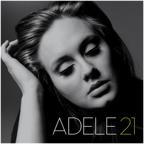
Recently there as been a selection of new remixes of Adele songs by "Urban Noize". These include Melt my heart to stone ft. Kanye West and Won't Go ft. Jay-Z.


As you can see in these album covers they both have a "green theme' which uses a greenish background and a green font. The photos are generally quite dark and are high contrast emphasizing the shadows on the artists. This is important to note for our own DVD/digipack cover.
Monday, 10 October 2011
Test Footage
Over the past couple of lessons, We have filmed and edited our test footage. Our test footage will enable us to preview what some of the shots we have chosen will look like in the music video. We have also viewed what colour tint looks like on the footage using a blue tint and a sepia tint.
Sunday, 9 October 2011
Analysis: Previous Music Video (Group 19)
We viewed a previous group's music video to gain knowledge of what a good music video project should look like. In Group 19's music video they used the song "Heart Skipped a Beat" by The XX.
The video suited the genre has it was very artistic, with the graffiti and the editing techniques used such as rewinding the video and adjusting the speed. The music and lyrics fit together, the narrative is very loose but there is some reference to the two singers being a couple. The thought that the shots and visuals all followed together very well, the shots showed continuity and the colour filter used did create a warmer tone as the group had suggested. I thought that the shots at the beginning, in the intro section of the song, were particularly professional. This because the lighting highlighted the objects well, the group had obviously thought about the lighting. The artist, The XX, has been represented as being of the indie genre and shows an appeal to the lower class with the graffiti and damaged location. There is obvious voyeurism in the piece, this is particularly realistic as the actors do not look at the camera for most of the video, and actions do not seem forced. However, the voyeurism is more relevant when the video shows narrative.
The video suited the genre has it was very artistic, with the graffiti and the editing techniques used such as rewinding the video and adjusting the speed. The music and lyrics fit together, the narrative is very loose but there is some reference to the two singers being a couple. The thought that the shots and visuals all followed together very well, the shots showed continuity and the colour filter used did create a warmer tone as the group had suggested. I thought that the shots at the beginning, in the intro section of the song, were particularly professional. This because the lighting highlighted the objects well, the group had obviously thought about the lighting. The artist, The XX, has been represented as being of the indie genre and shows an appeal to the lower class with the graffiti and damaged location. There is obvious voyeurism in the piece, this is particularly realistic as the actors do not look at the camera for most of the video, and actions do not seem forced. However, the voyeurism is more relevant when the video shows narrative.
The editing techniques used in the music video were good, it was cut on the beat and the lip-syncing was almost flawless. They also decided to use extra effects such as colour correction, and speed adjustment to give the music video some depth and create and interesting effect which suits the style of the video.
Subscribe to:
Posts (Atom)